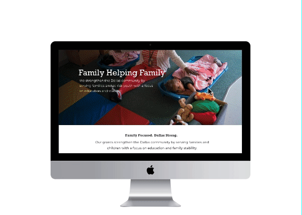
The Hoglund Foundation came to us to originally have their annual report redesigned. But they soon realized, with our help - that a brand refresh and a new website would be a perfect way to celebrate their 30th year.


Working in collaboration on wireframes and the sitemap, our ux and ui strategies were able to be fleshed and thought out. I was able to bring my familiarity with Sketch into this project, and I believe that made a huge difference in the final design and execution.
The original intention was to create a website that was simple and able to show off the fun, creative side of a very serious family-owned foundation. With a refresh of the logo and brand colors, it became easier to add a bit of personality to an originally, very dated, very busy site.
Creating wireframes for each page, each button, and each intention. We started to work on telling the history and story of Hoglund, and how much they help the city of Dallas.
Working intimately with developers, we used InVision to bridge the gap between design and code - which was so much fun to dive into.


